Field Notes2018-01-24Santa Cruz Bicycles Website Reimagined

A fresh new look and enhanced usability
After many months of code-writing and pixel-pushing, we are very excited to announce the launch of the refreshed Santa Cruz Bicycles (SCB) website. Featuring a new look and enhanced functionality, the website is even more captivating and user-friendly.
Santa Cruz Bicycles are industry leaders with a very strong heritage and fanbase. VentureWeb has been their digital partner since 2013. From the outset, we have collaborated closely to create SCB’s web experience.
The primary goals of the updated website were to:
- Create a more engaging brand experience on the homepage.
- Reimagining the UX for the individual bike pages.
- Overhaul the online store.
- Create a digital style guide to ensure brand consistency across all digital properties.
- Custom multi-region and multilingual intelligence.
- Enhance the bike builder experience.
Bike builder
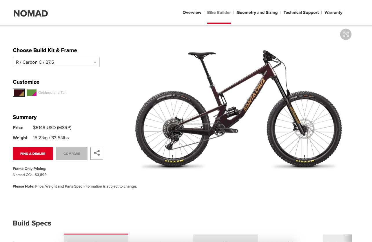
Years ago, we built SCB a proprietary bike builder that enables users to build their dream bike, share it via social channels, and then find a nearby dealer where they could purchase that bike.
We’ve totally refreshed that bike builder using React. Users are now able to customize their bikes to an even greater degree and we have implemented functionality that allows users to build and compare up to three bikes. The backend of the builder is reconfigured to make it more flexible and easier to administer. And it has also been future-proofed, with the tool being built in a way that will allow it to service numerous user-facing systems and multiple configurations beyond its current applications.

Online store
Another massive undertaking was the overhaul of the online store. We have created our own API to ensure a more seamless interaction between the website and store. We have also ensured that the store adheres to SCB’s rigorous brand standards and improved the overall shopping experience by redesigning the product pages and implementing faceted navigation.
Design and style guide
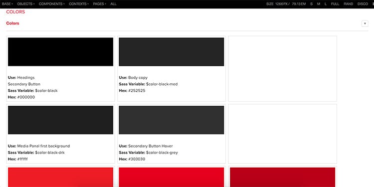
On the design front, VentureWeb worked closely with SCB’s in-house designers to translate their strong branding to the interactive digital realm. We developed a comprehensive style guide, which breaks down each design feature into its constituent elements and collates them in one place.
Creating a digital style guide enables a more streamlined development process: the styles can be created independently from the backend development and then applied when necessary. It also makes it much easier to maintain consistency in how the branding is applied - essential for a company like SCB, which has a worldwide reach, multiple web properties, and dispersed distributors and retailers.

Regional sites
The website caters to 12 separate geographical regions. Each region has specific product offerings and the user is able to view the content translated into their preferred language. We also display weights and measurements in metric or imperial (depending on the users’ location) and show prices in their local currency.
Testing
Many hours have been spent testing the new site on a multitude of different browsers, platforms and device types. With such a large and complex site it has been a big challenge to iron out all the bugs and display incompatibilities.

Let's ride!
After many hours of work from the combined VentureWeb and SCB team, we are super stoked to be launching this baby. Now, it’s time to ride!


