Field Notes2017-11-28Maximizing Website Content with a UX Revamp

Take your advanced studies in backcountry shredding with G3 University
Genuine Guide Gear (G3) is an industry leader in the backcountry ski and snowboard world. Started in a North Vancouver garage in 1995, G3 is dedicated to designing and manufacturing gear for skiers and snowboarders to have fun and be safe in the backcountry.
Using content to establish brand awareness
All of G3’s staff are passionate skiers and snowboarders. They also have an impressive posse of athletes and ambassadors with a huge amount of experience in the mountains. G3 has leveraged this wealth of knowledge by creating blog and video posts spanning a broad range of winter backcountry topics. In the past few years, they’ve created over 120 posts, each covering a specific skill or tip - from how to fold your climbing skins in the wind to crevasse rescue techniques. Collectively, it’s referred to as G3 University or G3U.
It’s a content strategy that has very positive impacts on brand reputation and goodwill as well as search engine optimization. In sharing their technical know-how and genuine passion, G3 is establishing themselves as the respected expert in their category. The posts help their audience expand their knowledge, whether they’re experienced backcountry shredders or fresh newbies. Some of the posts are specifically about G3’s products - for example, advice on how to choose the best climbing skins - while others are skill and technique-focused. None put the “hard sell” on viewers. The overall effect is a strong sense that these G3 guys and gals know what they’re talking about - and they’re cool.

UX changes to give full effect to the content
VentureWeb has been the digital partner of G3 since 2008. We’ve designed and developed their website and executed digital and social marketing campaigns that have driven strong traffic to the G3 University content. However, as the amount of content grew, the user experience (UX) wasn’t quite up to scratch: it didn’t enable users to quickly and easily access all the great stuff that G3 has been creating.
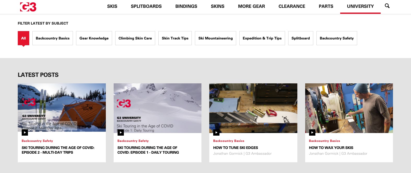
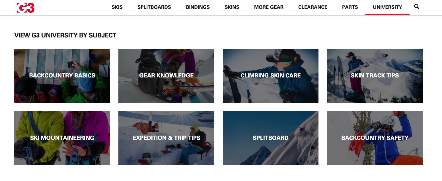
So this year VentureWeb, led by UX and interface engineering whiz, Roger Sarrasin and master designer, Murray Falconer, overhauled the G3U section of the website. There’s a new look and a revamp of the filtering tools so that users can browse all the posts and easily find content on specific topics. Changes were also made to make the life of backend admins happier, with a customized CMS allowing for editing and more flexibility of posts.
Content development has become a key area of focus for many of our clients. For websites like G3 that contain a lot of content, it’s important to think hard about the UX. There is a tricky balance to strike between giving users enough that they can understand what you do and swamping them with an overload of information. This is where clever UX comes into play and tools such as faceted navigation, filtering, hidden content, and modal windows and reveals are really useful.

Striking a balance
The new landing page for G3U strikes this balance by showing the user a selection of the latest posts and offering intuitive filtering tools and links that funnel users to specific subject pages. The design is clean and simple. The options available are not overwhelming to the user, but cater both to the user who knows the specific topics they wish to learn more about and the user who wants to browse across all topics.
The filters at the top of the page employ technology called Vue JS that enables the filtered content to be shown instantly without requiring a new page load or being taken to a new page. Vue JS is an open-source JavaScript framework for building user interfaces. On this page it is employed to have the data for 100 thumbnails of video and blog posts already loaded in the background, so it can be instantly displayed when the user selects a filter. All that data is in a text file that is just 43KB - smaller than most images on the site.
Conclusion
Creating useful and enjoyable content is one of the best ways that a brand can establish itself as an expert in their category. G3 has done this very well. It is equally important to ensure that people can easily access the content, which is where UX and content strategy come in. Intuitive filters, search functions, and browsing will make sure the time and money put into creating content will continue to pay off, rather than get lost in the black hole of the internet.


