Case StudyKorua Shapes
Shaping the digital presence of the world’s foremost snowboard brand
Visit WebsiteIn 2020 Korua Shapes approached VentureWeb to help them redesign and replatform their website. Korua’s brand is visually distinct, and their website needed to communicate their brand ethos. Further, Korua needed a tool that would grow with their business and could efficiently scale internationally.
Korua’s objectives for the project included:
- Applying Korua’s branding to a custom-built Shopify Plus theme
- Improve UX to ensure the buyer consideration phase is informed and intuitive, allowing riders to identify with their riding style and select from Korua's range of innovative boards
- Introduce regional functionality to display price and language based on user location
Speaking Korua’s language
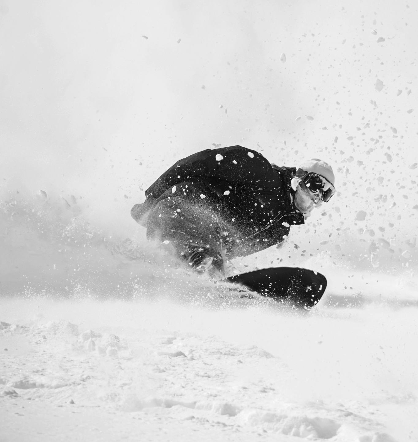
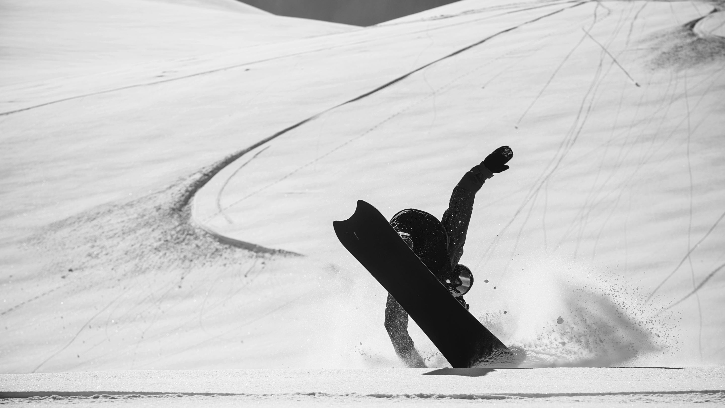
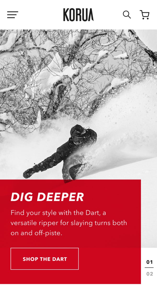
Upon visiting the Korua website, the first thing you are struck by is its aggressive graphic language. This is no accident. Monochromatic greyscale dominates the page, with flashes of red drawing the user’s attention. The website was designed to echo Korua’s board-first design ethos, which places the board’s connection with the snow above all else.

If I were a board, which board would I be?
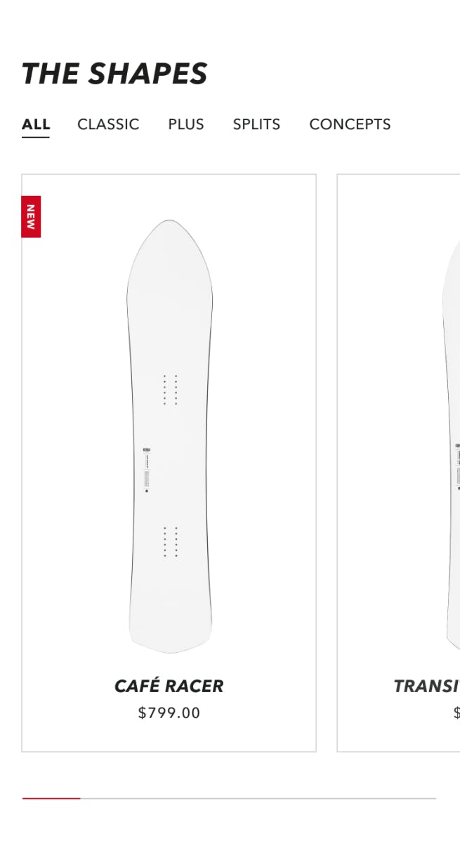
Korua’s shapes are anything but cookie-cutter. For the potential rider, a quick understanding of what differentiates board shapes is critical. At the PLP-level, board diagrams rather than lifestyle shots are used to reinforce their shape differences, and a short description appears upon hover that communicates the board’s intended use, from a “lightweight transition magnet” to a “modern all-mountain ripper”. A togglable filter list rounds out the PLP functionality, allowing users to filter further based on categories like expected terrain type, camber type, and length.
At the PDP level, a helpful “personality” section with rating scales ranging from 1-10 on a variety of metrics including “Carving” and “Backcountry/Trees” help users determine if this is the board for them. Product reviews at the bottom of the page add a layer of validation. Just be careful browsing down there, it's a daunting task counting up all those 5-star reviews.
Big in Japan, and everywhere else
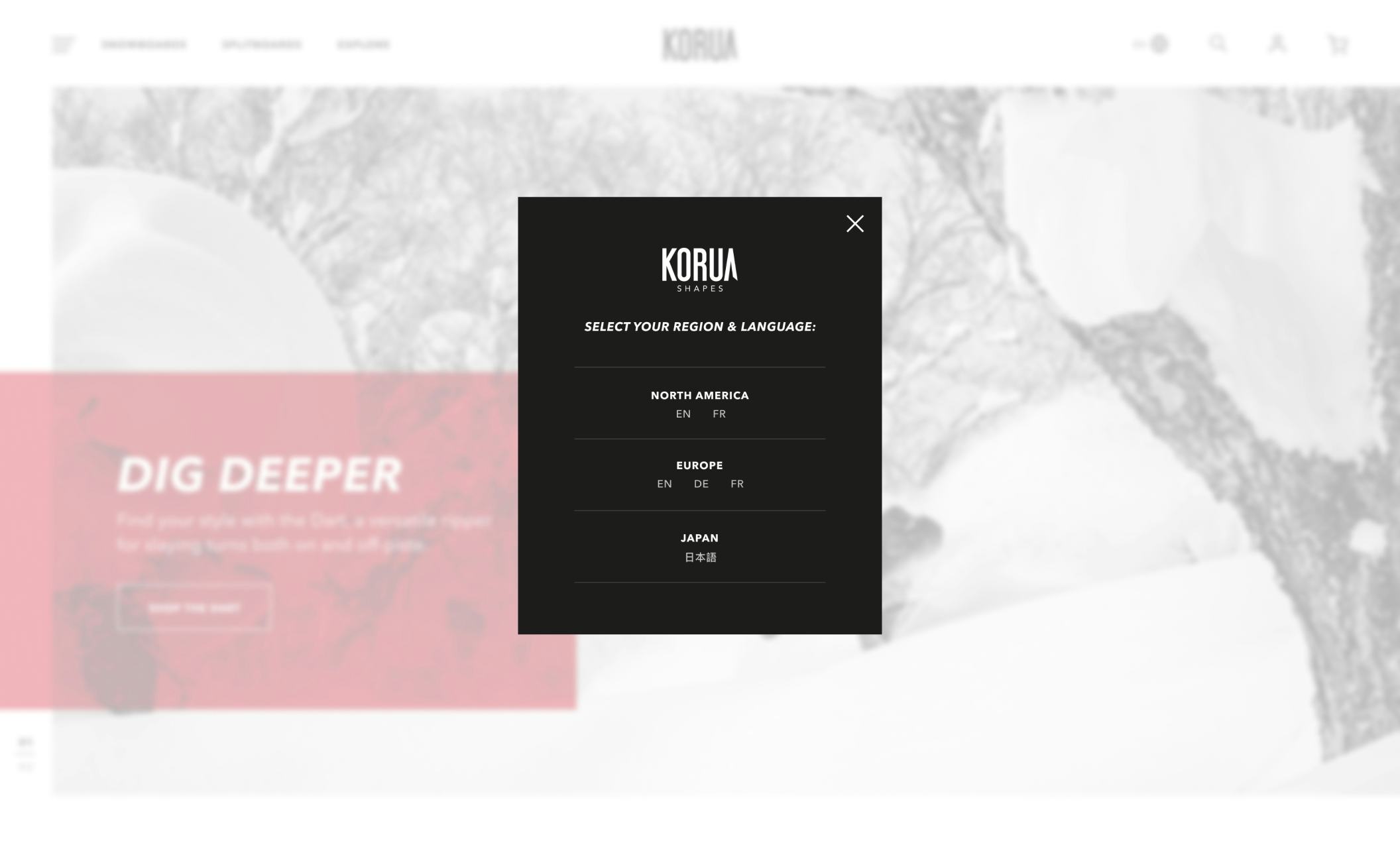
Japanese-inspired and Swiss-designed, Korua’s boards are built for some of the most sought-after terrain on the planet. And riders around the world are seeking them out to carve up their home mountains with. That meant introducing multi-region functionality that serves different languages and currencies based on the user’s browsing location.
For those who want to try before they buy, prominent dealer locator and test ride buttons line the top of the footer. So no matter where you are in the world, there’s no excuse not to try out a Korua shape this season.
Services
A forward-thinking client requires an innovative approach.
- Strategy
- CMS selection & planning
- User experience evolution
- Wholesale & pro customer management
- Creative & Design
- Wireframing and Information Architecture
- Creative design & direction
- UI & interaction design
- Technology
- Custom Shopify Plus theme design
- Implementation of pro purchase functionality
- Selection & implementation of all apps
- Multi-region/currency storefronts
Related Work
Big mountains. No lineups? Yes, please.
