Field Notes2024-07-08Grand Tour Grand Slam
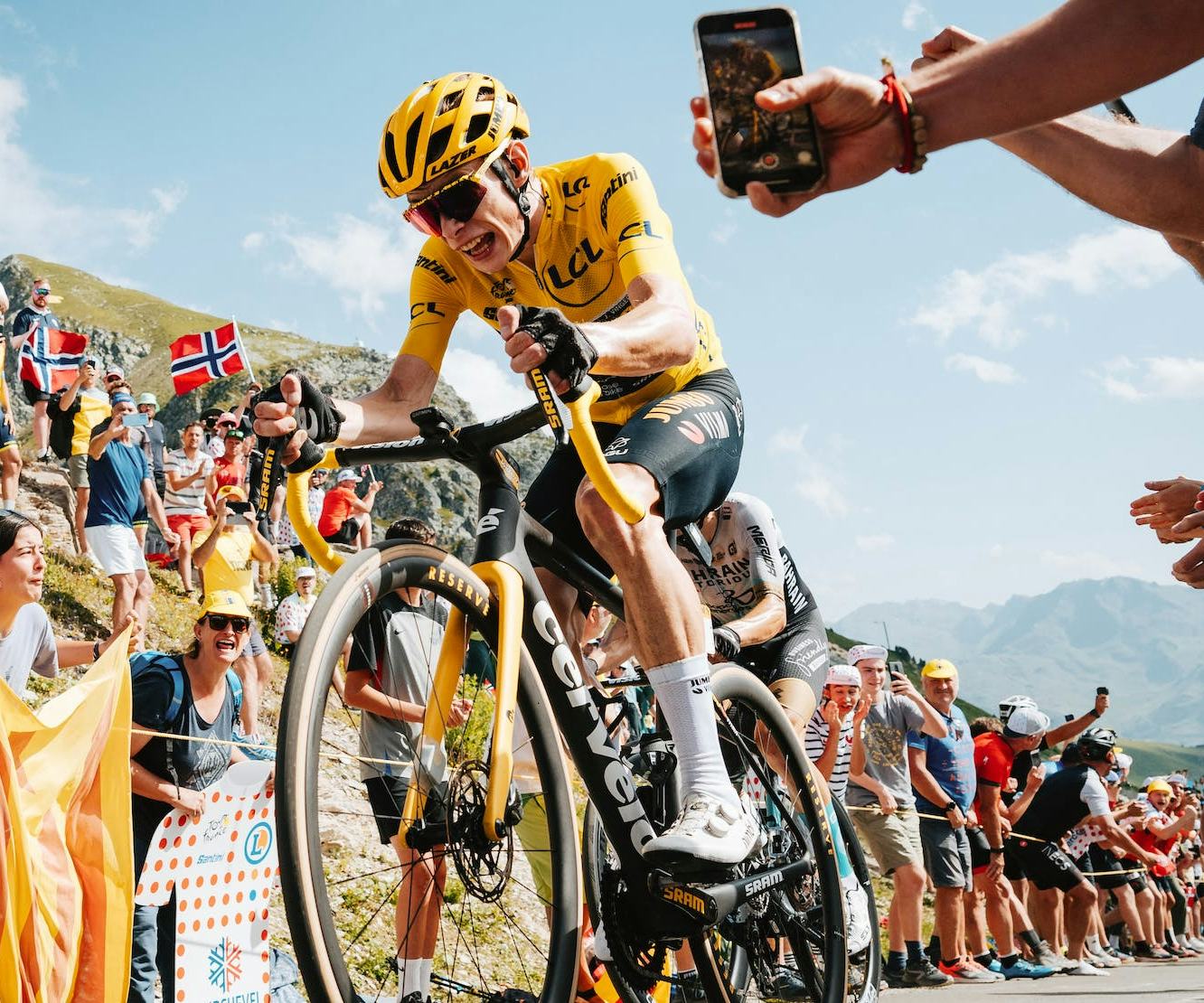
A digital celebration of a once-in-a-lifetime achievement
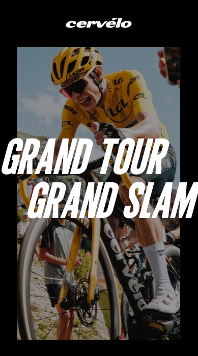
When Team Jumbo-Visma did the unthinkable and won all three of the 2023 Grand Tours with three different riders, their official bike partner, and our client, Cervelo tasked us with memorializing the achievement digitally.
It goes without saying that we wanted to make this project special given that this was the first time that a team has ever won all three Grand Tours. We set out to make an immersive and engaging experience that was worthy of this milestone.
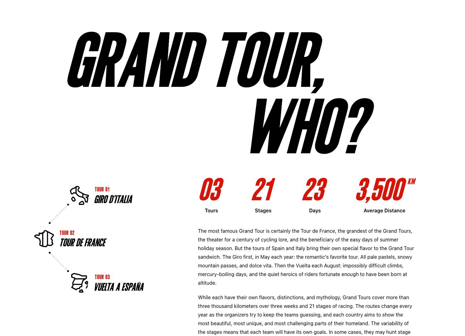
Once we had some inspiration, a lot of motivation, and a solid approach for the project, we dove into the design and UX. The first step was to make sure that users were educated about the Grand Tours and what they entail.
A multiple-persona mandate
When designing the Grand Tour page, we identified three personas to assist with the UX and content development. They were:
- The OGs: The people have been following the Grand Tours forever. They know the teams, the riders, the events, and the heinous climbs and they live for the drama and the statistics.
- Bandwagon Jumpers: Prior to the 2023 Tour de France, Netflix developed a limited series featuring the Tour de France using the same format as the highly acclaimed Drive to Survive series about F1. This brought significant attention to the Tour de France from many around the world for the first time (including several on the VentureWeb team) and we wanted to ease them into the storytelling.
- The Uninformed: In the outdoor industry, we know there are potential customers who know nothing about professional athletes, teams, and events. They like their sports for individual reasons including exercise, camaraderie, and challenging themselves. But we also know that when they're in their buying journey, knowing that a bike won the Tour de France will almost certainly impact their decision to purchase.
A content hierarchy to solve
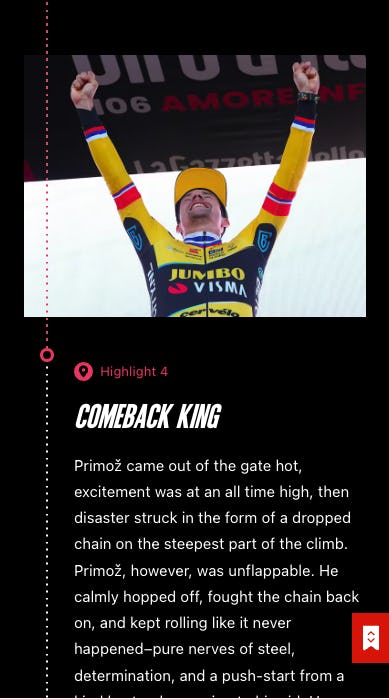
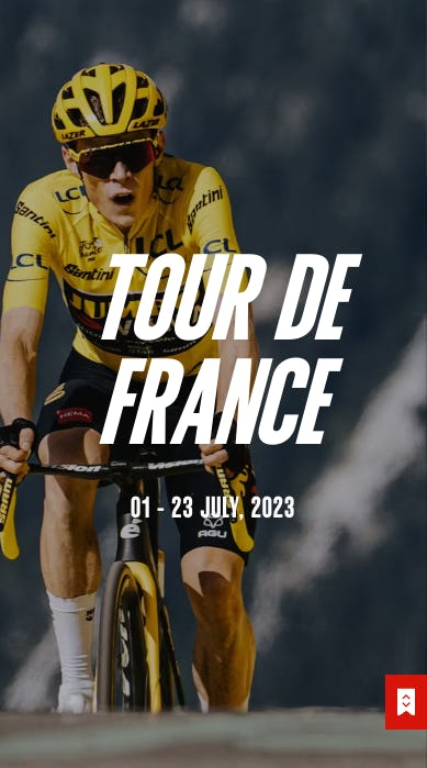
When developing the UX and content, we wanted to take users on a journey. For the OGs we wanted them to re-live the moments of glory, for the Bandwagon Jumpers, we wanted to highlight the most critical events, and for the Uninformed, we wanted to communicate just how incredible this feat was.
At the top of the hierarchy was each of the three Grand Tour events in chronological order. Each event showcases the statistics (which are almost incomprehensible for us mere mortals) and key moments. Users are then able to explore more about the bikes and each race's winner.
The result
After a speedy development process in close collaboration with our clients, we developed the Grand Tour Grand Slam page on the Cervelo website. The page was built as a single page react app deployed by Vercel and it leverages the GSAP animation library for all of the UI flourishes.